
2018 Winner
Ultima Foods
Olympic Packaging
lg2
SilverPackaging
Canadian dairy brand Olympic was more than 30 years old and suffering from low relevance due to an outdated image, identity and package design. A lack of a strong brand positioning was reflected in the brand’s core consumers: 55-year-old Western Canadians. This was not a segment that could be counted on to generate national growth. With packaging being the driving force of Olympic’s image, creative agency Lg2 needed to ensure it was a major contributor to Olympic’s business objectives: securing listings and generating growth.
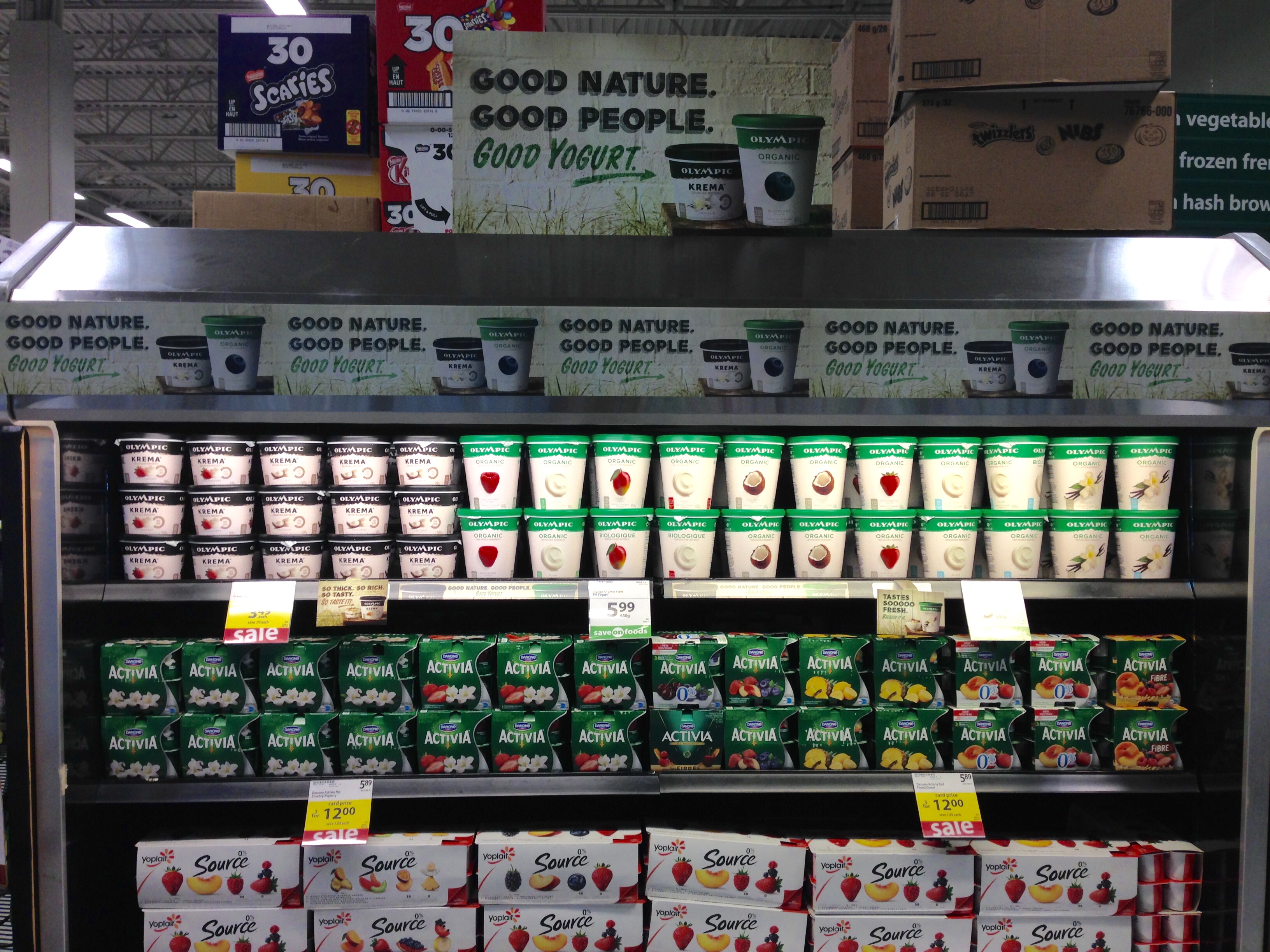
How could Olympic — a small dairy brand from a tiny, rural area of British Columbia on Canada’s west coast — become a leading Canadian brand and go head to head with giants like Danone, Yoplait, Astro and Liberté? Olympic needed to refresh its outdated image and position itself as a premium brand in order to connect with a younger set of consumers and penetrate key Canadian markets. It would start with its image on the shelf.
Olympic hails from Canada’s most socially conscious and nature-loving region: The west coast. Olympic’s redefined brand story, purpose and meaning clearly lay in its west coast DNA: socially conscious, strongly organic, healthy, ruggedly simple and inspired by nature.
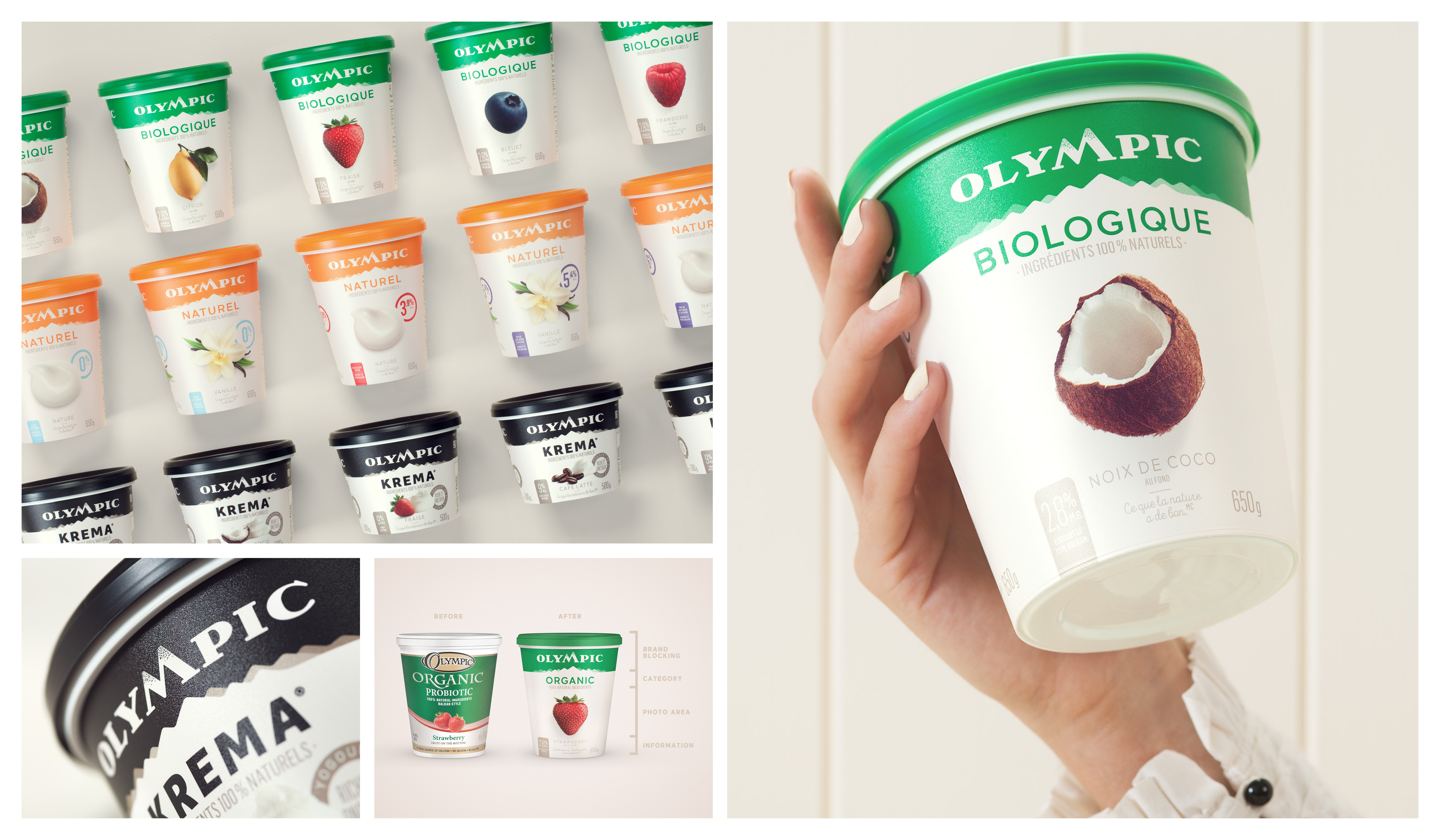
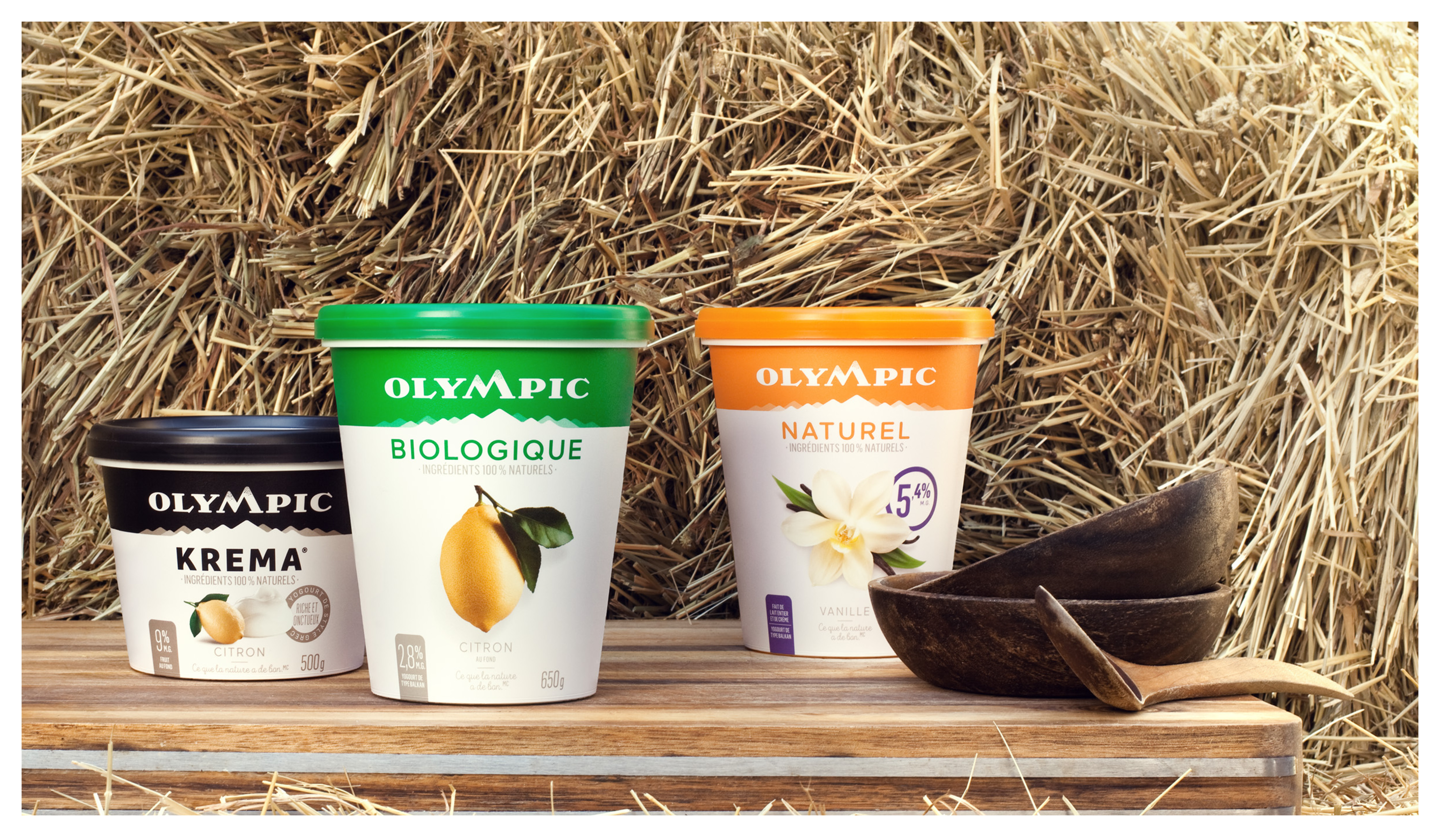
Taking its cue from this insight, Lg2 repositioned Olympic as “Canada’s premium yogurt brand made with a west coast spirit.” The agency started by developing a new product portfolio architecture: leaner and clearer, with three main product segments: Organic, Indulgence and Natural. The new Olympic logo was designed to convey the feeling of rugged, unspoiled nature, with a forest green master brand colour. The “M” in the Olympic name reflects the silhouette of a mountain, the west coast’s most iconic symbol.
Lg2 then redesigned the packaging, with one guiding principle in mind: Keep it as pure as the west coast spirit. Lg2 developed a clean and uncluttered design that reflects the origin of Olympic products. Each element was reduced to its simplest expression and each detail was thoughtfully designed to ensure the packaging reflects the nature of the contents. Repeated across all segments, the mountain range conveys the west coast’s majestic natural scenery while creating strong brand blocking onshelf.
In less than 8 months (August 2016–March 2017) Olympic became the fastest growing yogurt brand in Canada (L52 weeks +9%). It also became the fastest growing yogurt brand in every region in Canada (L12 weeks National +11%, Alberta +9%, Quebec +23%, Ontario +101%, West +6%). Business success is owed to new consumer acquisition (Millennials), existing consumer support and more than 50 new listings across the country.
Credits
Client: Ultima Foods
Agency: Lg2
Creative Directors, Design: Claude Auchu, Maude Lescarbeau
Graphic Designers: Jean-Philippe Dugal, Jean-Michel Tardif
Creative Directors, Advertising: Marc Fortin, Stuart Macmillan
Art Directors: Thibault Gehard, David Arcouette
Copywriter: Philippe Coulombe
Strategic Planners: Anne-Marie Leclair, Simon Joly
Experience and Design: Nicolas Baldovini, Joël Auchu
Account Executives: Mélanie Châteauneuf, Vanessa Dicaire, Marion Haimon,
Constance Delille, Sandrine Martin, Marie-Christine Cayer